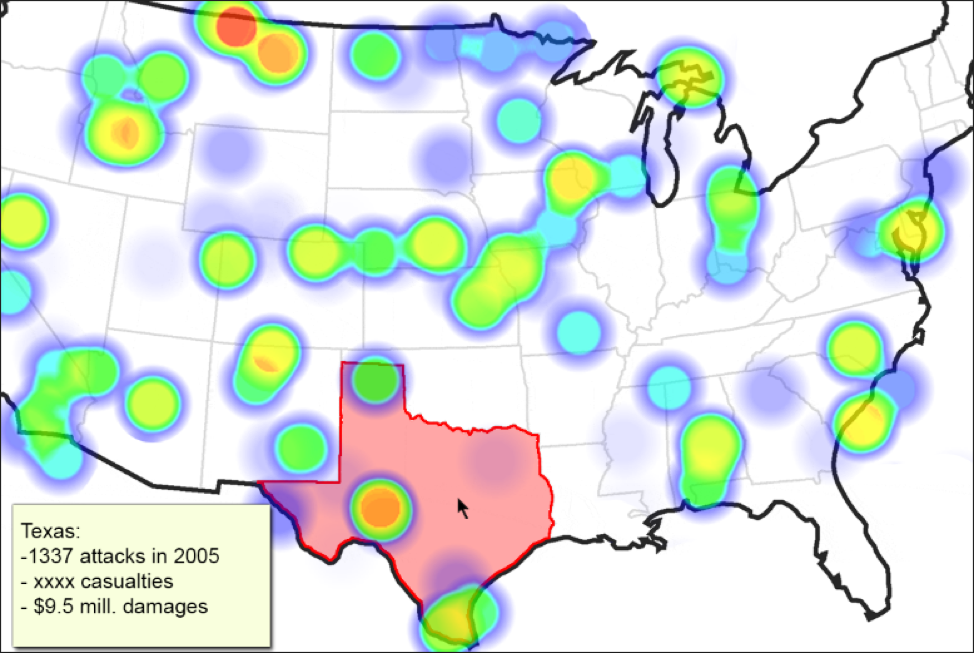
Figure 1: Example layout, displaying mouse-based region highlighting.
The dataset we have chosen is the Global Terrorism Database, containing ‘more than 150,000 terrorist attacks worldwide’ from 1970-2015. We plan to filter purely for the attacks on US soil (including Hawaii and Alaska and minor outlying territories). The primary visualization in our system will consist of a heatmap, where the user can filter by year (default should be display to display a heatmap for all) with clickable states/territories (outlined by shapes defined in GeoJSON files) that break down information for the given region. This may be accomplished through a secondary visualization appended to the page or a ‘tooltip’ drawn in a corner of the heatmap, depending on how far our JavaScript prowess can carry us.
Our user interaction will rely on panning / zooming the heat map, clicking on individual states/territories, as well as at least two dropdown menus: One to filter by attack type (of which there are ten, which we believe is an appropriate range for a dropdown) and one to filter by year. We had considered allowing the user to filter by group responsible for the attack, but this is open-ended for the moment as, in its unfiltered state, there are 3200 unique groups listed in the raw CSV. Should our filtering the dataset for attacks within US territories pare this down to a reasonable number, we may revisit it. It should be noted that meta information regarding which groups have perpetrated attacks in a given territory will still be displayed, regardless of whether we allow the user to filter for it.
Given that counter-terrorism efforts have been under such intense scrutiny in the media, especially in the light of the Syrian refugee crisis and the ongoing national debate about so-called “home-grown” (i.e. domestic) terrorism, our team decided it would be prudent to create a visualization to depict what the United States’ threat surface has looked like historically. Our hope is that this will help the end-user better understand just how widespread the threat is, and where it comes from. Is the threat primarily from within or without? Are attacks occurring primarily around major population centers, or are there under-reported incidents throughout the country? Was the attack successful, and if so, were there casualties or damages to public property?